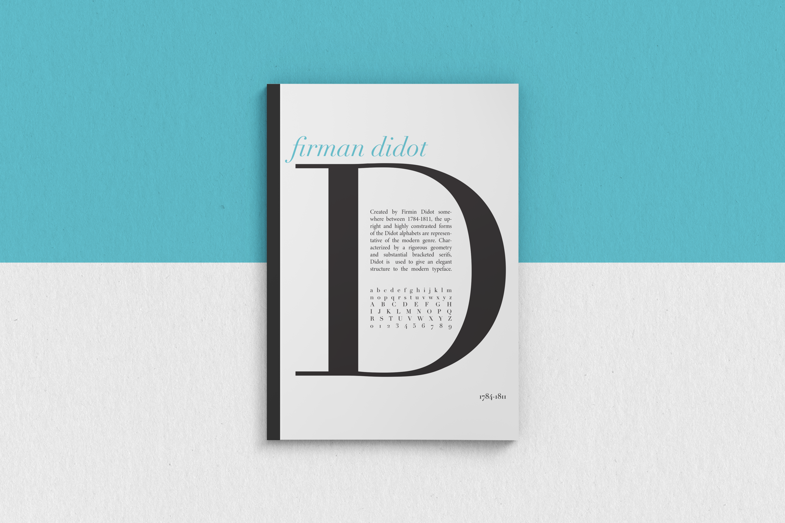
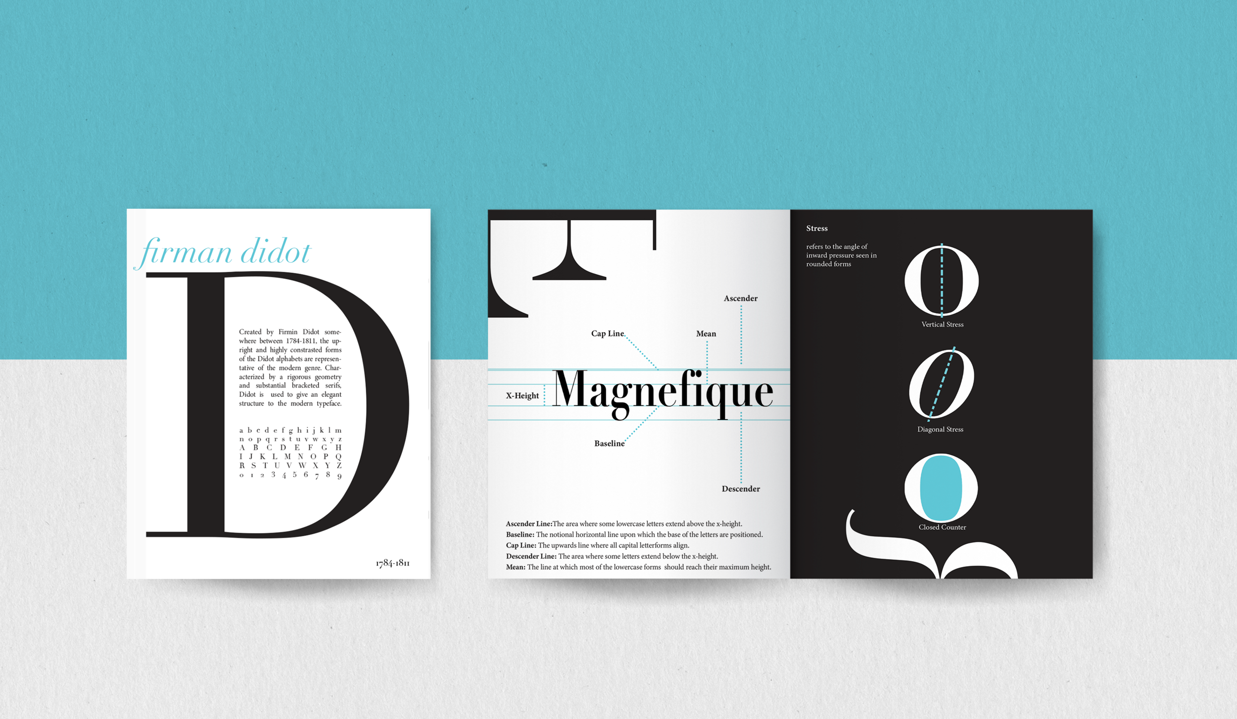
“Didot Elegance”
Project: Typeface Book
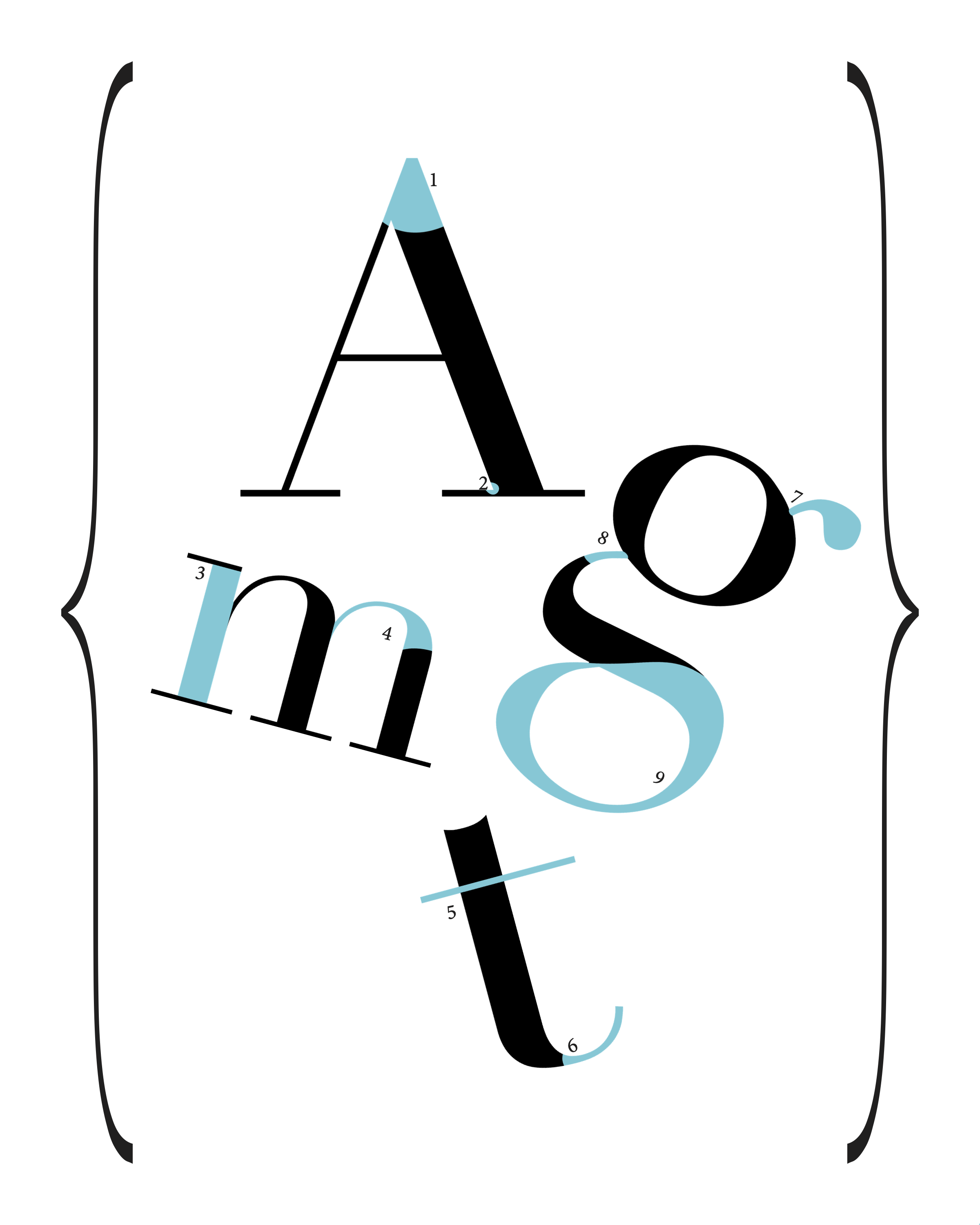
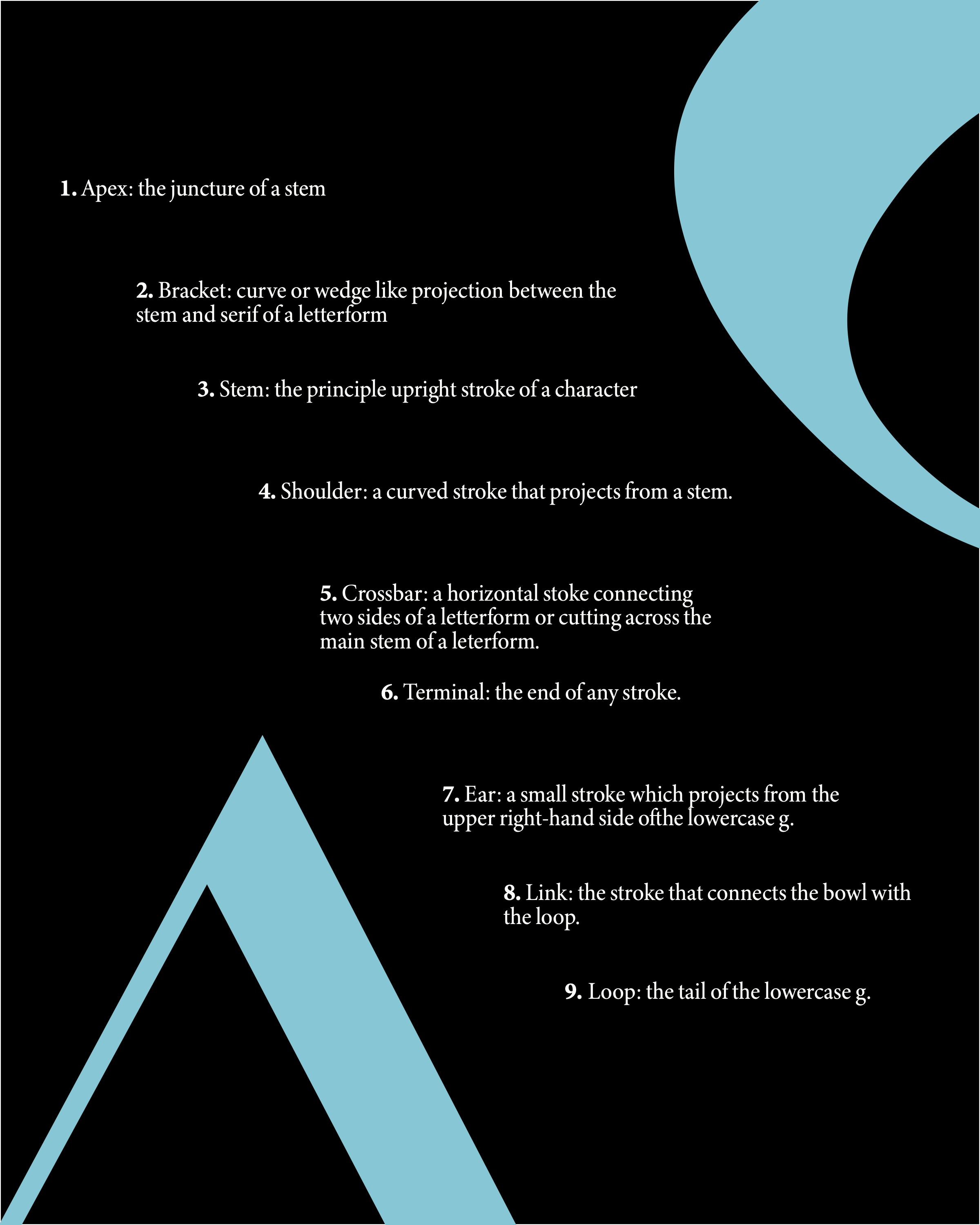
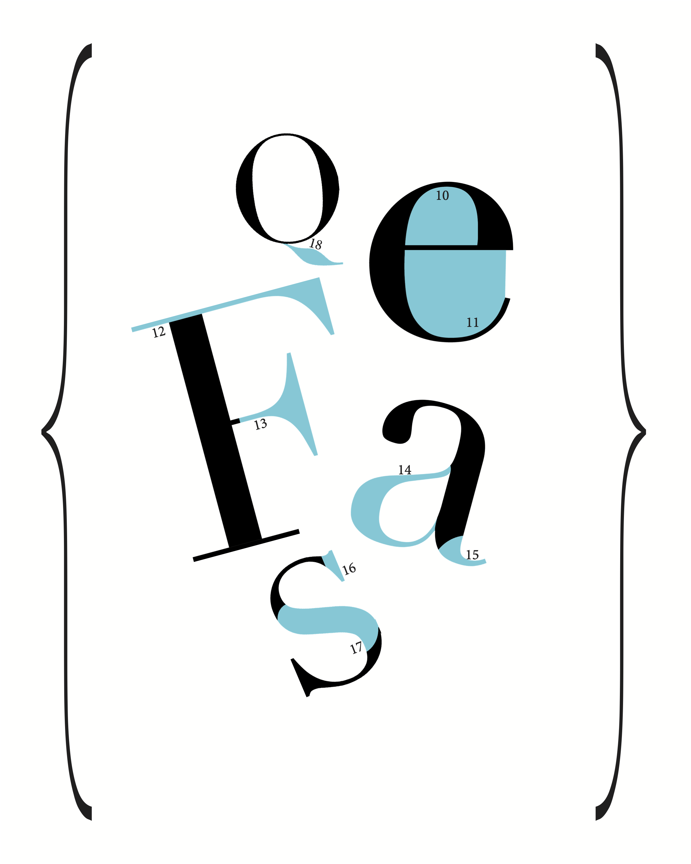
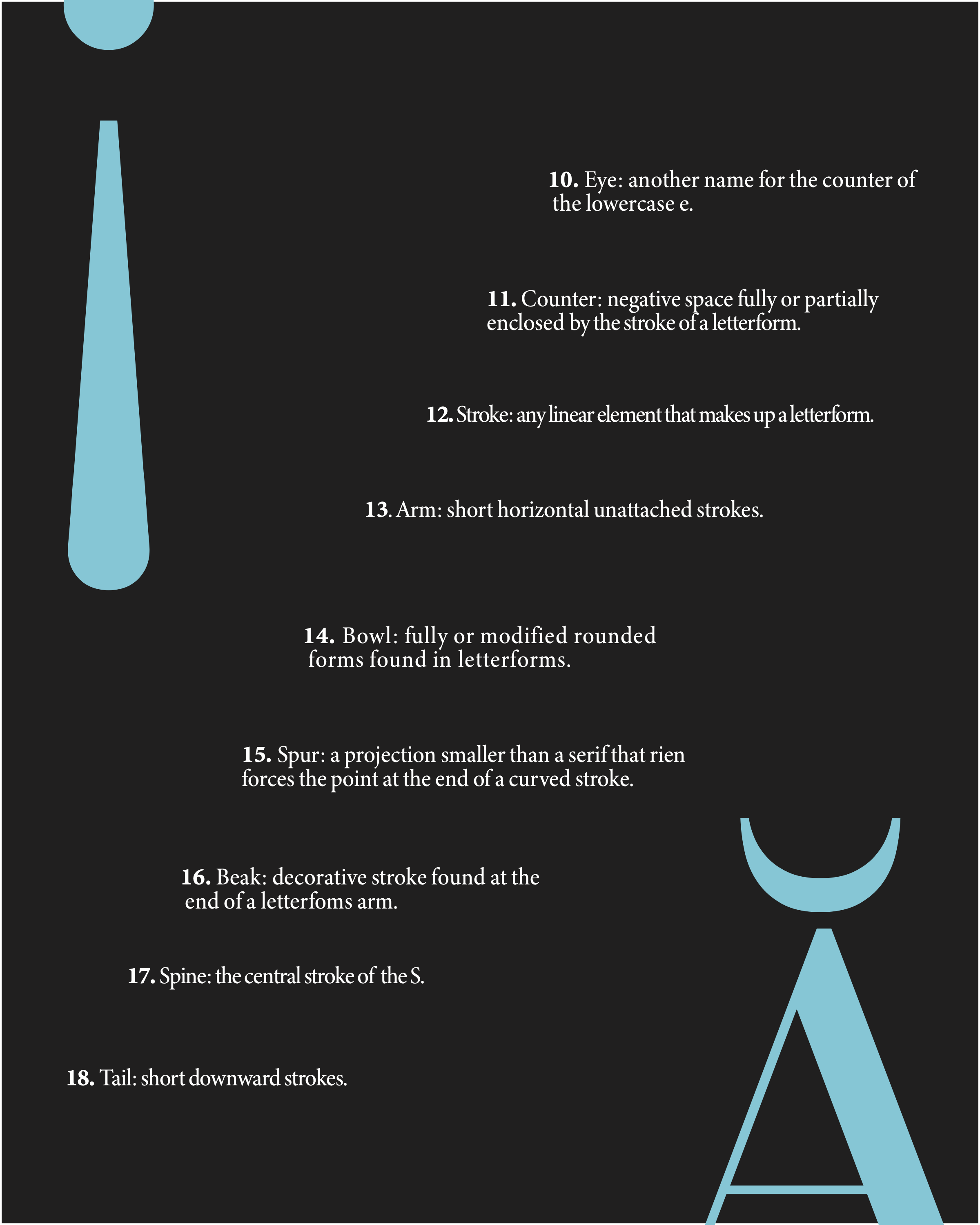
OVERVIEW: Experiment with layout design and grid systems while creating a book that celebrates the typeface Firman Didot.
PROBLEM: As this was one of my first layout projects, I had to successfully conveying the information I was presenting and balance the graphic elements that were added for emphasis.
SOLUTION: The spreads feature contrasting color schemes in black and white with blue pops of color throughout. I also used hierarchy within the elements to create emphasis while visually representing the text.
Projects
Font & Fabric
Mako Makes Art

Motion Design 2020